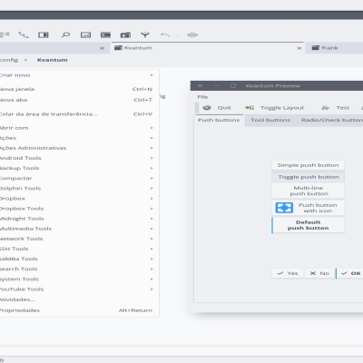
Description: Kvantum analog of awesome Yaru-Aqua-Light GTK theme, based on work by Tsu Jan. All credits to Yaru theme creators and customizators: https://github.com/tsujan/Kvantum https://github.com/Jannomag/Yaru-Colors https://github.com/ubuntu/yaru
Color scheme: https://www.pling.com/p/1368420/Last changelog:
Modern look of upstream Yaru
Updated it to look more consistent with upstream GTK theme
Hi! This is planned in the form of Aqua Dark (not orange, I mean like this but dark one) but it's going to be more difficult than it was for the light theme.
I also need to tune this one, it's not that similar to GTK style. Materia needs attention, too.
In case of no major distractions maybe in a couple of weeks I'll be able to present Yaru-Aqua-Dark, I hope.
I mean #00cfcf (the aqua color?) from the svg that seems to give the highlight color. I've edited the svg by replacing the the blues with browns, which I prefer.
I don't know if this is a bug with the theme or with kvantum, but the symbolic icon for inactive tabs (e.g. in dolphin) is white on a light background, and hence super hard to see. Any way to fix that?
Oh, our perception is very different then, to me #00cfcfis isn't bright at all, I'd call it quite dark aqua color. Also, the idea was to make a kinda analog to GTK theme, and this selection color is one of the basic colors, changing it would break visual consistency with the original GTK theme.
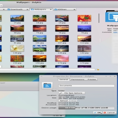
Regarding white symbolic icons, I guess you have some icon theme for dark backgrounds, but anyway, I couldn't reproduce the issue you are talking about. I've added 1 more screenshot to illustrate my words better.
Oh thanks very much and sorry to waste your time. I edited the config file a bit and apparently broke something. My inactive tab symbolic icons turn white. I'll have to fix whatever it is I broke in the config file. Cheers!


Ratings & Comments
10 Comments
9 9 excellent
10 10 the best
Most work was done by the original authors, Tsu Jan in particular, but thanks anyway!
Your version is also nice and hey I REALLY REALLY want the new ubuntu 20.04 yaru dark theme , any news on that ..?
Hi! This is planned in the form of Aqua Dark (not orange, I mean like this but dark one) but it's going to be more difficult than it was for the light theme. I also need to tune this one, it's not that similar to GTK style. Materia needs attention, too. In case of no major distractions maybe in a couple of weeks I'll be able to present Yaru-Aqua-Dark, I hope.
9 I like everything about this except the eye-piercing bright blue highlight color. Would love a more earthy toned version of this with warmer colors.
Hi, I'm not sure I have a full grasp of details you're talking about, did you mean #19b6ee as "bright blue"?
I mean #00cfcf (the aqua color?) from the svg that seems to give the highlight color. I've edited the svg by replacing the the blues with browns, which I prefer. I don't know if this is a bug with the theme or with kvantum, but the symbolic icon for inactive tabs (e.g. in dolphin) is white on a light background, and hence super hard to see. Any way to fix that?
Oh, our perception is very different then, to me #00cfcfis isn't bright at all, I'd call it quite dark aqua color. Also, the idea was to make a kinda analog to GTK theme, and this selection color is one of the basic colors, changing it would break visual consistency with the original GTK theme. Regarding white symbolic icons, I guess you have some icon theme for dark backgrounds, but anyway, I couldn't reproduce the issue you are talking about. I've added 1 more screenshot to illustrate my words better.
Oh thanks very much and sorry to waste your time. I edited the config file a bit and apparently broke something. My inactive tab symbolic icons turn white. I'll have to fix whatever it is I broke in the config file. Cheers!