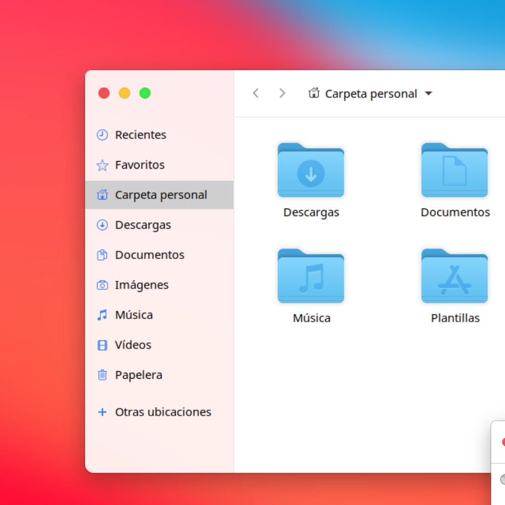
Description: theme for gnome, Modified from big sur theme by ELBULLAZUL the shell theme was modified, and the appearance of nautilus, the real merit goes to ELBULLAZUL.
Thank you, I am enjoying the theme. I notice that the navigation panel in finder and the logout screen are transparent and text is very hard to read, so I will have to switch back to a default theme for the time being, hoping for an update. Using Linux Mint XFCE, and tested with both Mkbigsur and BigSur-XFCE (the navigation panel is only transparent on the second one)
10First of all, Thank You!
For me, this is the best theme of macOS.
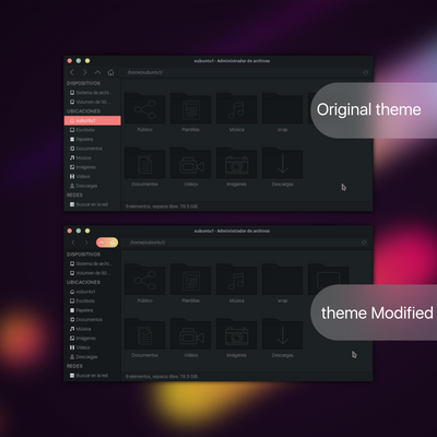
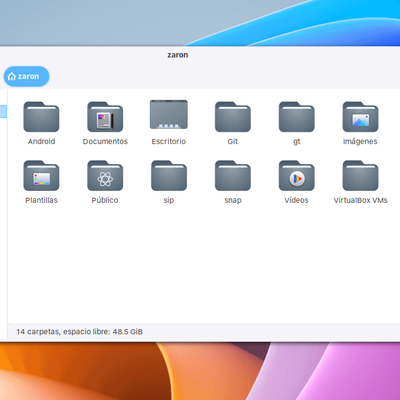
But about de theme, still have some bugs in nautilus gnome 42, but doesn't bother me. Some rounded borders still appear like sharp ones, and have a little space between the left side of nautilus and the right side.
hoping for new updates.
by the way, I'm using Fedora 36.
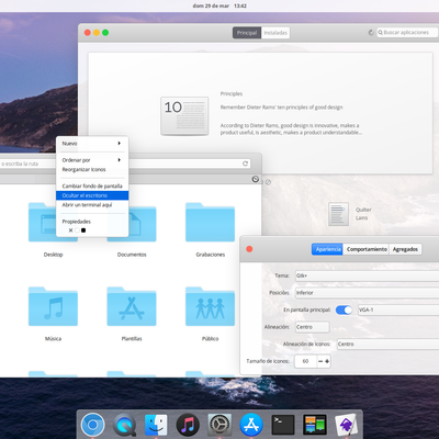
XFCE 14.6 on Debian. close/min/max buttons in nautilus show an opaque background on hover, minimizing then restoring the window returns transparency. Please offer a version without the translucent nautilus sidebar! Also the corners of title bars are quite jagged and the outline thickness through the corner is not consistent, kind of looks like text displayed without anti-aliasing. I may mod the right/left corner image files and see if I can improve it in this way.
This is a good theme, but it has a couple of quirks that should be addressed. In nautilus, the 3 dots for the dropdown menu is too far left of the minimize,maximize buttons, which makes it look a little off. The shell is really nice except that the dock looks weird being so big and also the top padding is way bigger than the bottom one, which pushes the icons down. Otherwise, still a solid theme.
9The best theme but the css for startup icon in gnome-shell is missing.
just add this lines of code to gnome-shell.css
.show-apps .show-apps-icon {
color: transparent;
background-image: url("assets/startup@2.svg");
background-size: contain;
}
9I really like this theme, however, titlebar/stoplight buttons are small in chrome/chromium. I am using ElementaryOS Pantheon 5.1.7.
The subheaders (I don't know what they're called, but like group of tabs in Code) are a little too big for me, is there a way to make it a little slimmer. Either way, nice theme. Thank you so much for this! <3
https://ibb.co/D9mkJgx
https://ibb.co/4dbMy6N


Ratings & Comments
49 Comments
10 The Best ever
Thank you, I am enjoying the theme. I notice that the navigation panel in finder and the logout screen are transparent and text is very hard to read, so I will have to switch back to a default theme for the time being, hoping for an update. Using Linux Mint XFCE, and tested with both Mkbigsur and BigSur-XFCE (the navigation panel is only transparent on the second one)
10 First of all, Thank You! For me, this is the best theme of macOS. But about de theme, still have some bugs in nautilus gnome 42, but doesn't bother me. Some rounded borders still appear like sharp ones, and have a little space between the left side of nautilus and the right side. hoping for new updates. by the way, I'm using Fedora 36.
8 Thank you
Remove Rating
Changelog please? Thanks!
the integration with glade was improved in the version for xfce4
XFCE 14.6 on Debian. close/min/max buttons in nautilus show an opaque background on hover, minimizing then restoring the window returns transparency. Please offer a version without the translucent nautilus sidebar! Also the corners of title bars are quite jagged and the outline thickness through the corner is not consistent, kind of looks like text displayed without anti-aliasing. I may mod the right/left corner image files and see if I can improve it in this way.
thanks for reporting, try to fix it
6 6 okay
This is a good theme, but it has a couple of quirks that should be addressed. In nautilus, the 3 dots for the dropdown menu is too far left of the minimize,maximize buttons, which makes it look a little off. The shell is really nice except that the dock looks weird being so big and also the top padding is way bigger than the bottom one, which pushes the icons down. Otherwise, still a solid theme.
9 9 Very good. No issues, Wish the white was more grey but that's a personal preference.
10 10 the best
Great, thank you! How to change Close, Maximaze ,Minimize icons to default Yaru ones?
In gnome 40 the solid part of title bat is coming over into the transparent area !!
unfortunate I have no where to prove that
9 The best theme but the css for startup icon in gnome-shell is missing. just add this lines of code to gnome-shell.css .show-apps .show-apps-icon { color: transparent; background-image: url("assets/startup@2.svg"); background-size: contain; }
try now
10 10 the best
10 10 the best
10 10 the best
10 .
Great theme!
10 10 the best
9 I really like this theme, however, titlebar/stoplight buttons are small in chrome/chromium. I am using ElementaryOS Pantheon 5.1.7. The subheaders (I don't know what they're called, but like group of tabs in Code) are a little too big for me, is there a way to make it a little slimmer. Either way, nice theme. Thank you so much for this! <3 https://ibb.co/D9mkJgx https://ibb.co/4dbMy6N