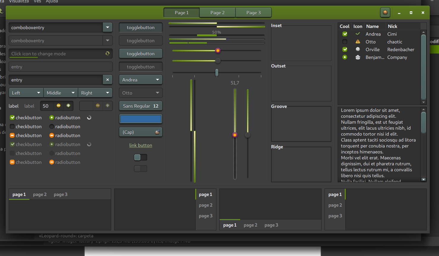
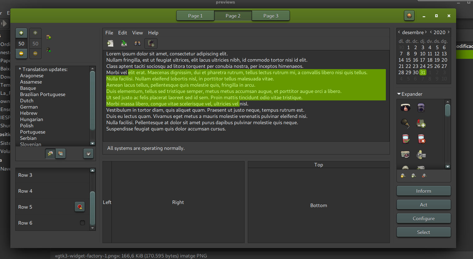
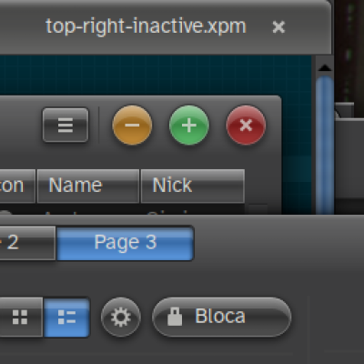
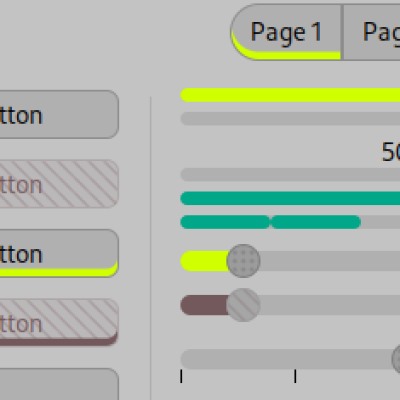
Description: This is another skeuomorphic theme. It's dark with green accents. It's easy on the eyes and I've tried to make it very usable, so elements are well contrasted.
This GTK theme is based on the wonderful pho series by GUILMOUR, such as Pho-Myrtus here: https://www.pling.com/s/Gnome/p/1240355/
This theme includes GTK3, GTK2 and XFMW (xfce window decoration). I have also prepared a KDE plasma color theme and QtCurve configuration for good desktop matching, but I still haven't published them properly, so I've included them in a folder called kde (the color theme is based on Obsidian Green Coast). You should import them from KDE's respective places It also includes Metacity, Cinnamon and Gnome Shell but they probably need work, I haven't reviewed them.
I also have a light version of this theme, pho-earth, here: https://www.pling.com/p/1467179/
Enjoy!Last changelog:
1.1
New year's eve update. Now buttons project a small shadow below! Also some bug fixes and improvements here and there. Enjoy!
[GTK+ 3.24.24, pho-earth (light variant) dc7d92c 2020-12-31]
Thanks for the update! I like the chunkier buttons, although the visual hierarchy seems lost a bit when they're on a popover. I think popovers may just need more shadow though?
Oh hey, it was you who made the Pandora glowing theme https://www.gnome-look.org/p/1396322/ .That's a fun one! Just thinking that this is sort of the Solarpunk counterpart to its Cyberpunk vibes~
^ Especially the light variant! Any chance you could publish it alongside the dark one here? I've been playing with it, and it works well. It looks good against retro terminal and editor themes like Gruvbox.
(You may be able to repeat what you did for the .tar.gz for more than one external link?)
And I've corrected the buttons for message boxes which certainly had their box-shadows removed. I guess the theme was built from an scss, and that's why its CSS is so messy. I have tried to enter this way of modifying themes but I have not succeeded yet. I'd love to be able to customize an Adwaita...
Thanks!. Hehe yes, I like big buttons for titlebars, like in default Adwaita styles. That's why I've also chosen default hidpi as base to create XFCE window decoration.
When I have some time I'll try to darken XFCE titlebar a bit, to match GTK CSD color.
9[GTK+ 3.24.24, pho-earth (light variant) fd24b54 2020-12-11]
The colours are lovely, and the light variant available via the author's gitea is worth trying if you prefer light themes.
Like all Pho themes, recent Nautilus (3.38) has inconsistent background colours in the main icons view when a second tab is open. To reproduce: open Nautilus, select the icons view, press Ctrl+T to open a new tab.
It gets a high rating because it's good to see a theme that isn't copying macOS or Windows, and that dares to be unfashionably non-flat and a bit colourful. Keyboard navigation is actually visible, albeit a little subtle, and that's a *really* important thing.
Thanks to the author for making something so nice and accessible!
Aw, I'm currently not using Gnome, so no Nautilus right now. If I find the time, I'll try it with a live distro and try to find the cause.
Thanks for your comments! Yes, I really like non-flat themes. I like buttons to look like real ones, with lighting and shadows. I'd also like to adding "lights" to indicate if a button is on or off, for example. If I had time and money, I'd spend many hours a day designing themes!
Maybe a VM if you need to keep stuff clean..
Anyway, after fighting a bit with the GTK inspector (GTK_DEBUG=interactive nautilus), I think Nautilus needs this in its current iteration. It's a complicated theme though, and these areas are styled in multiple places (inconsistently, and for a patchwork of old versions of Nautilus probably)
--- gtk-contained.css.ORIG 2020-12-24 02:02:34.926394234 +0000
+++ gtk-contained.css 2020-12-24 02:02:46.134490380 +0000
@@ -5110,5 +5110,5 @@
.nautilus-window notebook,
.nautilus-window notebook > stack:not(:only-child) searchbar {
- background-color: @theme_bg_color; }
+ background-color: @theme_base_color; }
/* Floating status bar */
Thanks for accepting. I pulled from git, and it's fine for the dark variant. Have to admit it's quite a sight-unseen fix as well, and probably fragile. I have *zero* idea why that weird ">" selector's there! There are probably far better ways of styling the current view (.view) and the sidebar (.sidebar) nowadays, but they all fight the legacy Pho theme stuff you've inherited.
BTW I use the light variant, and I don't see the patch in that repo yet :/


Ratings & Comments
19 Comments
10 10 the best
10 10 the best
[GTK+ 3.24.24, pho-earth (light variant) dc7d92c 2020-12-31] Thanks for the update! I like the chunkier buttons, although the visual hierarchy seems lost a bit when they're on a popover. I think popovers may just need more shadow though? Oh hey, it was you who made the Pandora glowing theme https://www.gnome-look.org/p/1396322/ .That's a fun one! Just thinking that this is sort of the Solarpunk counterpart to its Cyberpunk vibes~
^ Especially the light variant! Any chance you could publish it alongside the dark one here? I've been playing with it, and it works well. It looks good against retro terminal and editor themes like Gruvbox. (You may be able to repeat what you did for the .tar.gz for more than one external link?)
Iep, I've just published the light version here: https://www.pling.com/p/1467179/
And I've corrected the buttons for message boxes which certainly had their box-shadows removed. I guess the theme was built from an scss, and that's why its CSS is so messy. I have tried to enter this way of modifying themes but I have not succeeded yet. I'd love to be able to customize an Adwaita...
10 10 the best
9 9 excellent
7 7 good, color a bit too bright, titlebar too big.
9 I really like the depth of this theme. The only thing in Xfce is that the title bar is really BIG! LOL, other than that, it's beautiful! Thank you.
Thanks!. Hehe yes, I like big buttons for titlebars, like in default Adwaita styles. That's why I've also chosen default hidpi as base to create XFCE window decoration. When I have some time I'll try to darken XFCE titlebar a bit, to match GTK CSD color.
9 [GTK+ 3.24.24, pho-earth (light variant) fd24b54 2020-12-11] The colours are lovely, and the light variant available via the author's gitea is worth trying if you prefer light themes. Like all Pho themes, recent Nautilus (3.38) has inconsistent background colours in the main icons view when a second tab is open. To reproduce: open Nautilus, select the icons view, press Ctrl+T to open a new tab. It gets a high rating because it's good to see a theme that isn't copying macOS or Windows, and that dares to be unfashionably non-flat and a bit colourful. Keyboard navigation is actually visible, albeit a little subtle, and that's a *really* important thing. Thanks to the author for making something so nice and accessible!
Aw, I'm currently not using Gnome, so no Nautilus right now. If I find the time, I'll try it with a live distro and try to find the cause. Thanks for your comments! Yes, I really like non-flat themes. I like buttons to look like real ones, with lighting and shadows. I'd also like to adding "lights" to indicate if a button is on or off, for example. If I had time and money, I'd spend many hours a day designing themes!
Maybe a VM if you need to keep stuff clean.. Anyway, after fighting a bit with the GTK inspector (GTK_DEBUG=interactive nautilus), I think Nautilus needs this in its current iteration. It's a complicated theme though, and these areas are styled in multiple places (inconsistently, and for a patchwork of old versions of Nautilus probably) --- gtk-contained.css.ORIG 2020-12-24 02:02:34.926394234 +0000 +++ gtk-contained.css 2020-12-24 02:02:46.134490380 +0000 @@ -5110,5 +5110,5 @@ .nautilus-window notebook, .nautilus-window notebook > stack:not(:only-child) searchbar { - background-color: @theme_bg_color; } + background-color: @theme_base_color; } /* Floating status bar */
Hey, thank you very much for this! I have blindly included this in the new commit, so I'd say it should be solved if you download it now.
Thanks for accepting. I pulled from git, and it's fine for the dark variant. Have to admit it's quite a sight-unseen fix as well, and probably fragile. I have *zero* idea why that weird ">" selector's there! There are probably far better ways of styling the current view (.view) and the sidebar (.sidebar) nowadays, but they all fight the legacy Pho theme stuff you've inherited. BTW I use the light variant, and I don't see the patch in that repo yet :/
Oops, certainly, I forgot to modify the light variant too. Now it should be OK, thanks!
8 8 great
10 10 the best