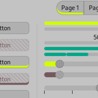
Description: This is an evolution of my Pho-earth by night theme (https://www.pling.com/p/1459383/), completely rebuilt using Azurra Framework by Elbullazul (https://github.com/Elbullazul/Azurra_framework). As you can see, it is yet another skeuomorphic theme. It is dark, with green accents. Disabled elements are brown. It is very three-dimensional, with shadows and highlights and everything. It used to feature a unique animation, never seen before in a GTK theme (that I am aware of): each time you activated a window, its title bar briefly shined. CSS animations have a great potential with GTK themes and have not been widely used (Materia themes are the ones with more obvious animations when clicking certain objects). Anyway, I removed it, and I'll use it for a fantasy-inspired theme that will see the light some day.
For this theme I recommend using non-flat icons. I love Newaita-reborn (https://www.pling.com/p/1625931), Obsidian (https://www.pling.com/p/1169579) or my own Buuf Nestort theme (https://www.pling.com/p/1012233/), which has colorful hand drawn icons, and also matches with Emerald theme, if you use Compiz. By the way: this GTK3 theme has absolutely no png or svg assets: everything is CSS magic, including checkboxes and radios.
For now I'll just publish this regular tar.gz file, and I'll update it when I create the repo so you can track changes directly.
I've tested it under XFCE and Plasma.
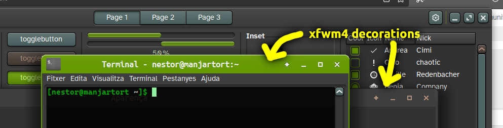
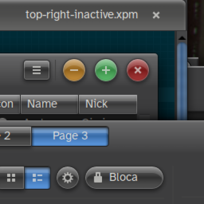
This themes includes the following elements: GTK2, GTK3, metacity, openbox, Unity, XFWM4, Cinnamon, Unity, KDE Color scheme, QT5ct color scheme and Emerald theme. Emerald window decoration can be seen in last image (it uses Buuf's colorful buttons) (GTK2, metacity, openbox, Unity, Cinammon and QT5ct color schemes were create using Oomox and then modified by me).
Donations I've decided to add an option to donate money: If I had enough time and income, I'd definitely dedicate much more time to this activity, which I enjoy very much. Thank you! https://paypal.me/nestorandreuLast changelog:
1.2
Made titlebar much smaller. Modified xfwm4 theme to reflect this, although I didn't shrink it as much.
91.2 is really pretty too! I think this theme is responsive to turning animations off in the DE (/org/gnome/desktop/interface/enable-animations in dconf-editor, used to be in tweak tool), so I'm giving a better score - that's my main problem dealt with!
Noticed a couple of bugs. In gnome-tweaks 40.0-6, the dividers have a green background. In Nautilus 42~beta-1, they've changed the path bar again, and the left side of each button other than the first one is missing (after the "/"es, like https://postimg.cc/t7k83sz2 )
Hey, thanks for the feedback! Ah, since I'm not using Gnome at the time, I didn't notice this Nautilus problem... I'll check it out in (hopefully) not much time. And yes, I will also remove the headerbar animation, and will leave it for a fantasy-inspired theme that might come out some day, that looks more like a game.
All right, dconf should look better now. I don't know who decided that separators have to be in a disabled row, but... The thing is that disabled rows were shown as if selected. And as far as Nautilus goes, until this new version does not come to Manjaro (which shouldn't take long, it's a rolling distro), I can't test it. Current Nautilus (41.2) looks OK. I've also dimmed a bit the headerbar green color, in order to better detect selected-coloured elements.
Preserving my old comment here because I'm changing my vote (for the better!)
(Note for downloaders: the titlebar icons come from your theme, iltimately. The wonky fun window buttons in the preview come from the Buuf theme. This theme suits Papirus (green, nordic, or bluegrey) as well, however.) I **really** dislike the massive distracting animation, but the button active/inactive colors are gorgeous. It's chunky and good. It could do with a bit more consistency for keynav (tab modifiers) highlighting. Subtle animation there could be nice. Thank you so much for making tabs that actually look like tabs, and generally bucking the trend towards flat areas with no borders or outlines. Any chance of a mid-light version of this theme, once it's cooked?
Hi, I've uploaded a new theme called Grass, here https://www.pling.com/p/1726175/, based on Soil, which is a light version of it (plus a few differences, such as the lack of black border around most controls, and a better xfwm4 theme which works great with Soil, too).
Well, if you search here for "skeuo" or "skeuomorphic", which is the technical term for an interface that tries to mimic real-life interactive components, you'll get some results. Also, This user has a few of them: https://www.pling.com/u/etiennegnome/, which are nice. Skeuos is a very high quality theme too: https://www.pling.com/p/1441725. There is a port of the old Human theme for TGK3 and 4 here: https://www.pling.com/p/1376363. And I'm surely forgetting some.
Thanks Triceratops and 1freepony for your comments! This is much more informative than just a number :)
About window button icons: exactly, they come from your current icon theme, I'll update this in the description. I am currently using my own Buuf Nestort theme, so that's why they appear like that. Maybe I'll include a capture using another theme, so it is more obvious that this is what happens.
As for the titlebar animation: I was inspired by some Enlightenment themes, which feature such animation (which looks very "gamy", that is, very typical of computer games UI). For my taste it is subtle enough, but of course, everyone has different tastes ;)
As for the titlebar (headerbar) size: yes, it's big, but that is because I like it so. I love those huge Adwaita buttons: closing windows is something one does quite often, so having a big button there makes sense to me. It's true that depending on the size of your screen, that may be a waste of space.
If you'd like a lighter theme, I also have Pho-Earth (https://www.pling.com/p/1467179/), which is a previous version of some of the ideas here, and which is a direct modification of some themes called Pho-* (like Pho-Myrtus https://www.pling.com/s/Gnome/p/1240355/).
I haven't paid attention to key navigation indicators, true, and that's something I'll address in a future version. I'll also make overshoot more shiny.
This theme differentiates the color of the headerbar, which is great. The window in focus change the color which is plentiful enough. From the user experience standpoint, I find that animation effect rather counter-productive.
There is a lots of works in this theme to fit many Desktop envs. I can comment only for GTK3. The window controls buttons are too big, causing the headerbar to be unnecessarily big. As color and taste goes, I am not very fan of the yellow/green tone. Otherwise there is a lot of good things in this theme.


Ratings & Comments
20 Comments
10 i LOVE this theme, it makes my computer feel so fun! I could click the buttons for hours!
8 8 great
9 1.2 is really pretty too! I think this theme is responsive to turning animations off in the DE (/org/gnome/desktop/interface/enable-animations in dconf-editor, used to be in tweak tool), so I'm giving a better score - that's my main problem dealt with! Noticed a couple of bugs. In gnome-tweaks 40.0-6, the dividers have a green background. In Nautilus 42~beta-1, they've changed the path bar again, and the left side of each button other than the first one is missing (after the "/"es, like https://postimg.cc/t7k83sz2 )
Hey, thanks for the feedback! Ah, since I'm not using Gnome at the time, I didn't notice this Nautilus problem... I'll check it out in (hopefully) not much time. And yes, I will also remove the headerbar animation, and will leave it for a fantasy-inspired theme that might come out some day, that looks more like a game.
The global animation setting controls whether the headerbar shimmers, so that's OK (for me). I prefer running without anims anyway.
^ I meant to say dconf-editor 40.0-6 for the dividers. Pic: https://postimg.cc/Yj6HGFMh
All right, dconf should look better now. I don't know who decided that separators have to be in a disabled row, but... The thing is that disabled rows were shown as if selected. And as far as Nautilus goes, until this new version does not come to Manjaro (which shouldn't take long, it's a rolling distro), I can't test it. Current Nautilus (41.2) looks OK. I've also dimmed a bit the headerbar green color, in order to better detect selected-coloured elements.
Preserving my old comment here because I'm changing my vote (for the better!) (Note for downloaders: the titlebar icons come from your theme, iltimately. The wonky fun window buttons in the preview come from the Buuf theme. This theme suits Papirus (green, nordic, or bluegrey) as well, however.) I **really** dislike the massive distracting animation, but the button active/inactive colors are gorgeous. It's chunky and good. It could do with a bit more consistency for keynav (tab modifiers) highlighting. Subtle animation there could be nice. Thank you so much for making tabs that actually look like tabs, and generally bucking the trend towards flat areas with no borders or outlines. Any chance of a mid-light version of this theme, once it's cooked?
Hi, I've uploaded a new theme called Grass, here https://www.pling.com/p/1726175/, based on Soil, which is a light version of it (plus a few differences, such as the lack of black border around most controls, and a better xfwm4 theme which works great with Soil, too).
10 Thank you SO much for making a non-flat, three dimensional, skeuomorphic theme. I for one cannot wait for the flat UI trend to be over with.
10 Wonderful theme !!
9 I love good old non-flat themes and this is one of the best. Any recommendations for more?
Well, if you search here for "skeuo" or "skeuomorphic", which is the technical term for an interface that tries to mimic real-life interactive components, you'll get some results. Also, This user has a few of them: https://www.pling.com/u/etiennegnome/, which are nice. Skeuos is a very high quality theme too: https://www.pling.com/p/1441725. There is a port of the old Human theme for TGK3 and 4 here: https://www.pling.com/p/1376363. And I'm surely forgetting some.
9 a thinner bar for gnome would be fantastic, thanks
10 10 the best
7 7 good
Ilike animations, and theme but dislike huge headerbar. Is there possibility to make version with smaller headerbar.
Thanks Triceratops and 1freepony for your comments! This is much more informative than just a number :) About window button icons: exactly, they come from your current icon theme, I'll update this in the description. I am currently using my own Buuf Nestort theme, so that's why they appear like that. Maybe I'll include a capture using another theme, so it is more obvious that this is what happens. As for the titlebar animation: I was inspired by some Enlightenment themes, which feature such animation (which looks very "gamy", that is, very typical of computer games UI). For my taste it is subtle enough, but of course, everyone has different tastes ;) As for the titlebar (headerbar) size: yes, it's big, but that is because I like it so. I love those huge Adwaita buttons: closing windows is something one does quite often, so having a big button there makes sense to me. It's true that depending on the size of your screen, that may be a waste of space. If you'd like a lighter theme, I also have Pho-Earth (https://www.pling.com/p/1467179/), which is a previous version of some of the ideas here, and which is a direct modification of some themes called Pho-* (like Pho-Myrtus https://www.pling.com/s/Gnome/p/1240355/). I haven't paid attention to key navigation indicators, true, and that's something I'll address in a future version. I'll also make overshoot more shiny.
This theme differentiates the color of the headerbar, which is great. The window in focus change the color which is plentiful enough. From the user experience standpoint, I find that animation effect rather counter-productive. There is a lots of works in this theme to fit many Desktop envs. I can comment only for GTK3. The window controls buttons are too big, causing the headerbar to be unnecessarily big. As color and taste goes, I am not very fan of the yellow/green tone. Otherwise there is a lot of good things in this theme.
Thanks for your comments! I'll answer above