Available as/for:plasma-5
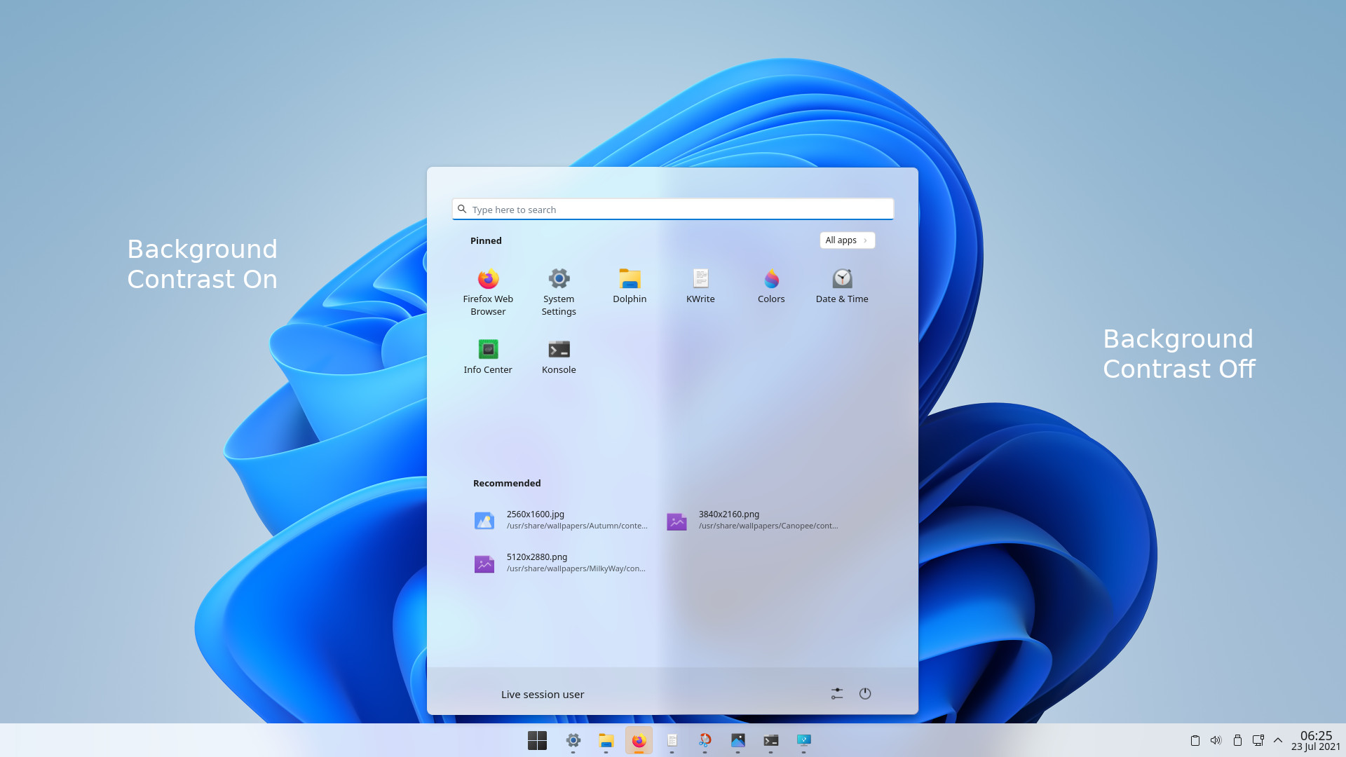
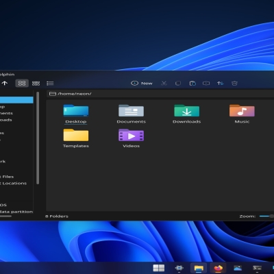
Description:A Windows 11 style plasma style. I prefer this theme with "Background Contrast" ON. See Willow Desktop to automatically install this theme.
Configuration info is available at Willow's Github page.
Light Window Decoration
Dark Plasma Style
Color Schemes
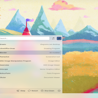
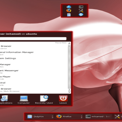
Some icons are borrowed from yeyushengfan258's "Win11OS" plasma theme. The icon pack is Win11 with a few of mine. The application style in the screenshot is called Lightly by Luwx. Anything Willow-related that has "blur" in the name is meant for use with Lightly's blurred toolbars. The menu widget seen here is Menu 11 by prateeksu. Icons and directions available at source.
Anyway, I hope the KDE devs figure something out before this type of hacky theme making becomes mainstream.


Ratings & Comments
13 Comments
9 9 excellent
While I have my own reasons for why this theme is not a 10, what holds it back for you?
I rarely give a 10. For something to get a 10 from me, it has to really stand out, and it has to be tested rigorously to look good with any applet that uses standard components (cough Zren cough), any panel config, several different resolutions, and many different wallpapers. Since I haven't yet tested this particular theme that thoroughly, it is a 9 for now because it made a great initial impression. Also, a dark variant would be even better (for me).
Ah, I just wanted to know if anything specific was an issue. I suppose I can answer for your review that it will fail in every configuration Windows 11 doesn't have or is not in my description. Several of the styles present are (technically) not possible with Plasma's theme engine. Sorry my advertising efforts aren't very strong, there is a dark variant. Source is most up-to-date.
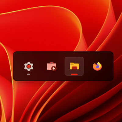
I found the dark variant shortly after writing my previous comment here. I ofc follow the theming suggestions in the description, but test with different panel arrangements (panel on the left, two panels, autohide, panel not being full length, etc. This might be a Pling issue, but if I search for 'Willow' in the search bar at the top of the page, neither Willow Light, nor Willow Dark show up. This makes it hard to find your theme on the store. Discover only shows the color scheme, but neither of the Plasma themes. I really like the app highlight effect in the taskbar in the screenshots above (the primary app color being used as background and for the indicator at the bottom). Do I need Latte for that to work?
Yeah... Pling's update has caused a number of problems, but it should work when I upload a global theme. Willow (mostly) follows the styling presented by Windows 11, so the "focused" state would be the bright box around Dolphin's icon. All of the screenshots are the standard panel. I believe you are referring to the orange "attention" state around Firefox. Unfortunately, it is impossible to inherit anything like a "primary color" from an icon, though you could propose it to Psifidotos.
Oh I see... Got tricked by attention state... Btw Latte kinda already has the feature I was talking about, in the Unity and Dash-To-Panel indicator styles. It wouldn't be hard to create a Win 11 indicator style that has that primary color feature, which would look great IMO. Have you considered making a GTK theme to accompany your fantastic theme? Even if I use KDE, I just can't live without certain Gnome apps, and it would be great if they looked uniform, like they do with Breeze, Arc, Numix, Materia or macOS lookalike themes. What Lightly settings should I use to get the most out of the Windows 11 aesthetic?
Whoops, seems my comment never went through. Yeah, it seems do-able with what Psifidotos has put out. I have considered getting into styling GTK, but it seems to be a pain to maintain. I may in the future though, but I am a bit busy now. In the meantime, Vince Liuice will probably release a rounded version of Fluent. As for Lightly settings, besides what's in source, not much more can be done without changing Lightly's code.
Thanks for the answer! Regarding Lightly: I wasn't referring to a fork or patches. I was referring to the settings Lightly itself provides through a Settings dialog. What settings look the best with Willow? Do you have any recommended config?
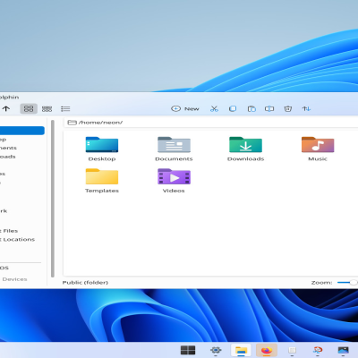
Yep, my recommended settings are at Willow's github page. I set the corner radius to 5px, Dolphin's side pane to opaque, and I uncheck "Transparent Dolphin View" so it has the white view area.
Thanks!
Awesome. can you make the icon pack and upload it here. Also can you make a dark theme i would like it thank you
I have added directions to source.