Description: The original cursor theme and how to properly install it can still be found here: https://www.pling.com/p/1457626
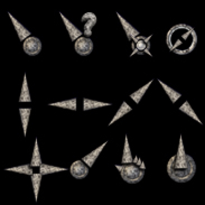
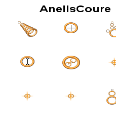
The purpose of this cursor set is to achieve a more consistent look between Enlightenment (aka Moksha) and Moksha green and Simotek's green openSUSE theme and the rest of the system.
The first three values should be added to the system configuration files. The fourth is optional -- only for those using some "kApplications".
~/.gtkrc-2.0 --> gtk-cursor-theme-name = "E-v2020-green" (this one is for GTK2 applications) ~/.config/gtk-3.0/settings.ini --> gtk-cursor-theme-name = E-v2020-green (this one is for GTK3 applications) /etc/lightdm/slick-greeter.conf --> gtk-cursor-theme-name=E-v2020-green (if you use LightDM)
~/Xresources --> Xcursor.theme:E-v2020-green (this one is for some "kApplications" -- QT)
Hi, MISSTELL, I like your job, but I have two suggestion. First: Can you made the cursor more bigger?, second: The link code should be green, not blue.
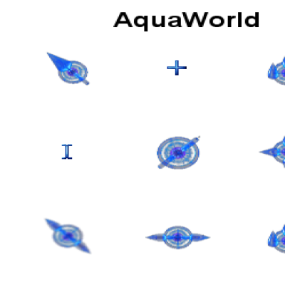
I am not sure what you mean by "the link code should be green, not blue", because all the blue elements were changed to green, except for one that was used by Chromium. I left it blue on purpose because Chromium will always show some blue elements, be it a web address search field or a blue dot on some icon, and it's hard to say which is worse: the "blue link" arrow with blue accents in Chromium while the rest of the system is green, or the green arrow in Chromium with blue accents while the rest of the system is green.
However, now I have also recolored the only intentionally left blue arrow to green. Please let me know if this was your second objection.
As for the size of the cursor, I'm not going to make it bigger, since I just recolored the existing cursor (link above). Making it bigger would mean redrawing everything from scratch, and there are also a couple of animations (each consisting of two dozen layers).
You say how you suggest the improvements and write "the link code should be green, not blue", but do not tell me what you mean by "the link code". I don't know what "link code" you have in mind. As for the "chrome arrow", I'm not sure the green arrow is an improvement over the blue one, but it's green now anyway. The problem is that Chromium has a lot of blue accents, and when you actually use search, it gets even more blue. https://postimg.cc/21MKPvdc | https://postimg.cc/7b9QqjMT


Ratings & Comments
7 Comments
10 10 the best
GREAT WORK!!! I'M NEED LIGHT VERSION!!!!
Hi, MISSTELL, I like your job, but I have two suggestion. First: Can you made the cursor more bigger?, second: The link code should be green, not blue.
I am not sure what you mean by "the link code should be green, not blue", because all the blue elements were changed to green, except for one that was used by Chromium. I left it blue on purpose because Chromium will always show some blue elements, be it a web address search field or a blue dot on some icon, and it's hard to say which is worse: the "blue link" arrow with blue accents in Chromium while the rest of the system is green, or the green arrow in Chromium with blue accents while the rest of the system is green. However, now I have also recolored the only intentionally left blue arrow to green. Please let me know if this was your second objection. As for the size of the cursor, I'm not going to make it bigger, since I just recolored the existing cursor (link above). Making it bigger would mean redrawing everything from scratch, and there are also a couple of animations (each consisting of two dozen layers).
Thank you for your answer, I was just suggesting improvements.
You say how you suggest the improvements and write "the link code should be green, not blue", but do not tell me what you mean by "the link code". I don't know what "link code" you have in mind. As for the "chrome arrow", I'm not sure the green arrow is an improvement over the blue one, but it's green now anyway. The problem is that Chromium has a lot of blue accents, and when you actually use search, it gets even more blue. https://postimg.cc/21MKPvdc | https://postimg.cc/7b9QqjMT
Color the arrow pointing to the links green, was the suggestion I was making. Thanks to you.