


Stearman C3B
starwolf


Source (link to git-repo or to original if based on someone elses unmodified work):
2.0.1
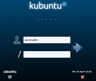
* fixed logo position
2.0.0
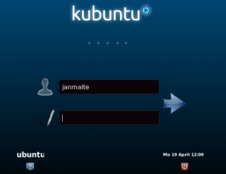
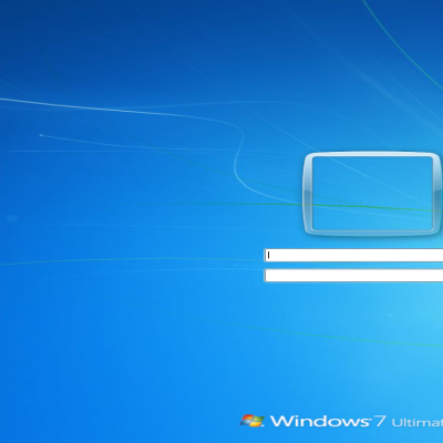
* switched to a new variante, based on the Kubuntu Lucid Simple Splash Screen. The "old" Ethias ist still available
* used excactly the settings from plymouth to adjust the images. it now "should" look excactly like the plymouth
1.2.0
* changed the background image a bit. Now matching the Kubuntu Lucid wallpaper
1.1.0
* changed the input fields to matching plymouth style
1.0.0
* first release


Other KDM4 Themes:

Ratings & Comments
9 Comments
I get a 404 error whenever I try to download this KDM. This makes me sad. The splash screen downloads just fine.
Nevermind. I had to click the "click here" link rather than waiting for the countdown.
Together with a self-made GRUB theme it makes the transition from turning on the computer to the final desktop so elegant and smooth. Who needs a Mac then? :P Would it be possible for you to create a screen saver of this style as well? Having the blue color and the kubuntu logo randomly changing position, similar to the Windows Vista screen saver? Would be much appreciated. :)
I really like it. So I have the nice Kubuntu boot splash, then comes the similar looking kdm screen, after that the nice KDE splash screen and finally my desktop. So it is a so-convenient look :) But, is it possible to remove the kubuntu icon or at least the five dots below it in the kdm theme? It looks a bit weird and unneccessary, as there is no progress going on. Still my favorite :)
But maybe with a think input bar for name and for password it's cooler :)
some elements are lookin not correct
1. My layout doesn't quite work, the entry boxes go too far left and the icons are overlapping out of the login area onto the background 2 - I'm not sure I like the black background, can that be changed or can you release a version with the lighter background as per the first screenshot? 3 - Perhaps just not to your taste, but my girlfriend and I always prefer when there's a list of users to click on, it's much quicker than having to type the names in. Really nice though, I hope it goes into Kubuntu, it's a shame to have inconsistent artwork across plymouth - kdm - splash - desktop.
1. Should now be fixed 2. A white variante is now available 3. I will have a look if this can be done with this layout. Please give me your ideas where to add a userlist and maybe how it could look like. At the moment i have no idea how it could look like. I hope this will become part of kubuntu 10.04, too. Or the Kubuntu Art Team make another one which integrates well with plymouth.
Thanks, I will try out the new version this evening. Re: user list, I liked the theme shipped with KDE 4.2 in this respect, see e.g. http://www.icon-king.com/wordpress/wp-content/uploads/2009/03/kdm-4-2.png http://img168.imageshack.us/i/kdm.jpg/