Description: Take a breath of cleaner air. Relax. Enjoy.
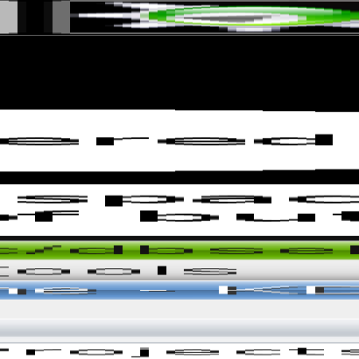
Breathe is a reworking of the Air icons and panel bar. Breathe removes all gradients giving a cleaner, crisper look. Some oversize and overly high contrast icons have been adjusted for more consistency. Message indicator now glows kde-blue instead of garish-green and has been sharpened up. In addition there are also icons for Amarok and Konversation bringing the crisp, white love to two favourite KDE apps. More to come.
Love, Bugsbane.Last changelog:
v0.5.1 KRandR, Bluetooth, preferences and Battery icons get the Breathe love.
1. Amarok - I could probably squeeze a pixel or maybe two taller. I just want to make sure that it's not larger than the other circular icons (devices, notification icon etc).
2. NM - That's likely an error. All I did was change gradients to flat white on the wireless icons. If it's changing sizes (and doesn't in Oxygen) then I've probably just grouped something wrong. I'm working on a wired desktop, and so haven't had as much chance to check that.
Thanks for the heads up!
I have tried and tried to get the "gray" kopete icon but no look.. it is as blue as ever. Also Mail looks as usual. Have swapped between Air and Breathe x number of times now.. anything else one can/should do?
Can you take a look in ~/.kde/share/apps/desktoptheme/breathe/icons/ and tell me if the files konvesation.svgz and konv_message.svgz are in that folder?
I'd love to help with this, and already have an icon design, but currently kde-pim doesn't support this theming feature. Apparently it's coming with Kontact2
Really good but as it stands I'm not really feeling it. Of course, I wouldn't be typing this message if I didn't think it could turn into a nice theme. I almost like it, but the panel gradience isn't ideal. E.g. if you have a dark wallpaper then part of the clock becomes illegible.
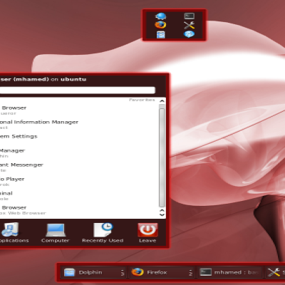
Yes, the panel gradient still needs work. Most of the work in this, is in the systray icons. Yes they're mainly very similar to Air (except Amarok and Konversation) however in general they're smaller, cleaner, with less gradients and unnecessary details.
I'll keep improving it, especially the panel. :)
The easiest way is to go into System Settings -> Workspace Appearence -> Get new Themes and then type in breathe in the searchbox. Then you can just click install. After that just choose Breathe as your theme. Earlier version had some packaging issues, but should be ok now.
NOTE: Some icons (especially network manager) seem to take a while to update. I'm guessing it's a cache thing, but if you click on another theme and then back on breath + apply a few times the icon cache is eventually cleared.


Ratings & Comments
11 Comments
1. The Amarok icon is too small and probably needs darker outlines 2. The NM changes sizes (medium strengh wifi: ok strong wifi: giant logo)
1. Amarok - I could probably squeeze a pixel or maybe two taller. I just want to make sure that it's not larger than the other circular icons (devices, notification icon etc). 2. NM - That's likely an error. All I did was change gradients to flat white on the wireless icons. If it's changing sizes (and doesn't in Oxygen) then I've probably just grouped something wrong. I'm working on a wired desktop, and so haven't had as much chance to check that. Thanks for the heads up!
I have tried and tried to get the "gray" kopete icon but no look.. it is as blue as ever. Also Mail looks as usual. Have swapped between Air and Breathe x number of times now.. anything else one can/should do?
Can you take a look in ~/.kde/share/apps/desktoptheme/breathe/icons/ and tell me if the files konvesation.svgz and konv_message.svgz are in that folder?
yes they are and looking as in your preview too. Kubuntu 10.10 and KDE 4.5.1 btw Regards Sinclair
I'd like to request an Akregator icon please.
I'd love to help with this, and already have an icon design, but currently kde-pim doesn't support this theming feature. Apparently it's coming with Kontact2
Really good but as it stands I'm not really feeling it. Of course, I wouldn't be typing this message if I didn't think it could turn into a nice theme. I almost like it, but the panel gradience isn't ideal. E.g. if you have a dark wallpaper then part of the clock becomes illegible.
Yes, the panel gradient still needs work. Most of the work in this, is in the systray icons. Yes they're mainly very similar to Air (except Amarok and Konversation) however in general they're smaller, cleaner, with less gradients and unnecessary details. I'll keep improving it, especially the panel. :)
How can I install the icons?
The easiest way is to go into System Settings -> Workspace Appearence -> Get new Themes and then type in breathe in the searchbox. Then you can just click install. After that just choose Breathe as your theme. Earlier version had some packaging issues, but should be ok now. NOTE: Some icons (especially network manager) seem to take a while to update. I'm guessing it's a cache thing, but if you click on another theme and then back on breath + apply a few times the icon cache is eventually cleared.