
Bare Naked
Source (link to git-repo or to original if based on someone elses unmodified work):
Available as/for:
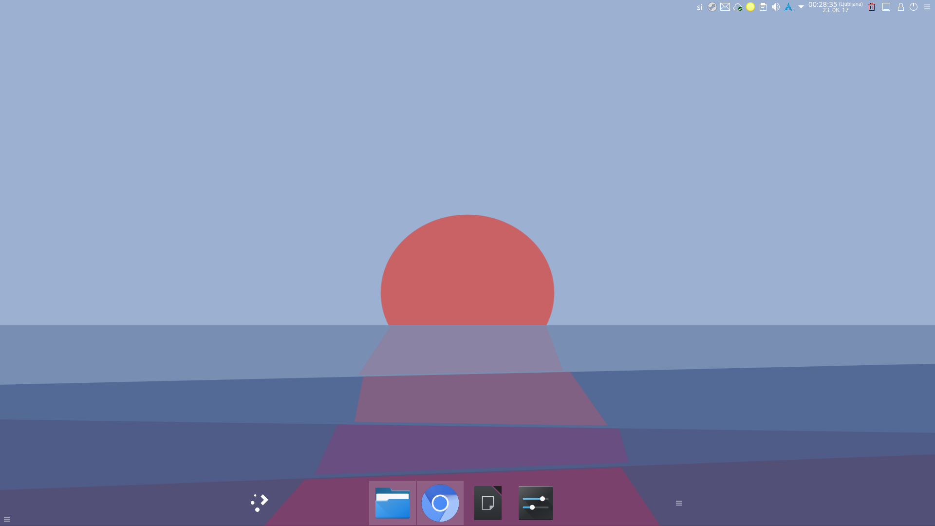
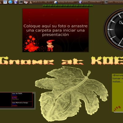
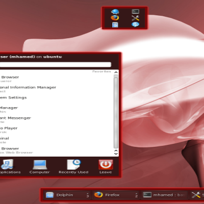
Description:I hardly call it my as it copies heavily from Naked. It's more or less Naked with totally transparent panels and it uses Breeze icons.
Version 3.1 made with QTStep.source theme maker script, it also uses that colour scheme.
Hopefully this will work
I dug out some old version of Bare Naked, and when I installed it directly from a file it worked (after being broken for quite some time). So hopefully it works.
Don't ask me how I fixed it, I have no idea. Again it's literally an old file I found so yeah.





Ratings & Comments
32 Comments
This theme is broken because it does not return proper metrics in some cases, for example ::mask() from panel-background svg is totally broken. That behavior creates a bug in Latte that some settings windows are not shown. The designer has chosen to remove many required elements from svg elements and that could create plenty of issues. Best approach would be these elements just to become totally transparent with opacity:0% in order to be invisible but at the same time to provide proper metrics for calculations.
I'll be brutally honest: I have no idea what I'm doing. I'm aware for some time now, that the theme is somewhat broken, as I actually do use it even to this day. But back when I made this theme, I just took Naked theme and set opacity to 0% in InkScape. But that also broke through time, so the ext one was made with QTStep script, where again opacity was set to 0%. And as you've noticed, this also broke. I thought I fixed, this but apparently not. So I wish I knew how to fix this permanently, I mean as you wrote best to not delete any elements, but just set the opacity to 0%, so I guess my best bet is to just edit the Breeze theme (as it's default) and set opacity to 0%... I'm thinking the best thing to do is not to even bother with InkScape, or other WYSWYG editors, bbut just edit the svg files as text...
yeah dont worry, everyone is trying its best. I looked a bit the files. If you used Naked plasma theme then this is not a good start. Naked is a Plasma 4 theme that was never updated to Plasma 5. So any breakage may not be on your part, maybe you need to try to use a Plasma 5 ready theme for this.
9 +
9 Perfect. Manjaro KDE - testing branch -
Was perfect until the latest updates on Arch. On Fedora works perfectly! ;)
That's strange, because I'm using Arch as my main and only desktop, and haven't had any problems (yet).
Excellent jod. Only one suggestion (ior please, tell how to do it): improve the color font contrast for the backgrounds of the panel and other elements, like notifications. I think that with a color like #31363b instead of white, the contrast in could be improved. By example, in this example, cannot see the names of the apps. http://i.imgur.com/Umivx8f.png
any chance of adding the system tray extender icon? thanks,
Well most of you probably know that this theme isn't working on KDE<4.3. I know that and I've been meaning to repair that for quite some time, just didn't found time to do it yet... But I promise that I will. I do miss this theme my self it was so minimalistic. There are few themes that are similar to this one, but I didn't found any of them to do exactly what I wish for completely transparent theme...
Just what i was looking for ! Now i can put a numeric clock on my plain , gray , clean , totally epured desktop. THANKS ! *\o/*
Since defining a custom file to be used for the panel background doesn't seem to work yet, this works perfectly for me. I only use my panels as place-holders since my TV has some bad overscan - seeing the edges of them on the screen was driving me nuts. Thanks! :D
I would like to chime in and say that I enjoy using this theme, in combination with naked for the info dialogs and krunner. I kind of wish that author would revert the pager theme to the one used in 1.0, akin to naked's pager. Yes, the clock in 2.0 could still use a little work, but I can use other clocks from other themes, so that is one little niggle that I can forgive.
Thanks! I appreciate that you like the theme. I'll consider the proposals that you made. I just want to know what's wrong with the clock. OK it's not really a eye-candy, but I feel that it does the job intended. I thought that a nice and simple clock will be best for the such a bare theme like this one. Anyway any feedback is welcome and I'll see what I can do about things. The reason why I changed the pager is that I feel that Aya's pager (the one I used in 2,0) is really cool as it looks like a tab to me... Maybe I'll try to build on that notion or maybe I'll just revert it back. I'll see.
I wish to know why are some down-voting this theme. So I can if the reasons are reasonable change the theme for the better. Every critique is welcomed!
Unfortunatly, some people vote stuff down on the basis of personal taste rather than whether it is good. So, if you consider that some people vote based on whether or not they would personally use the artwork, then anything over 30% would be considered good. OTOH, some people, like myself, vote based on whether someting is good, I will vote something as good even it it is not my personal taste. The unfortunate result of this is that the ratings really don't mean much if they are between 25% and 75%. But, I agree that people that vote something down should leave a message stating why they did so.
Very nice, just the clock is too dark for me, I would like to see it more crisp and clean with more contrast. Something like from slim-glow theme but with more cleaner lines. Also the system tray looks ugly when using compositing with this theme, but I know it is not your fault.
I agree that the clock is too dark and will work on that.
Excellent, can't wait for newer version!
Thanx for fixing the panel - works grat now! Keep up the work!
I was going to switch from Naked except the notes plasmoid was not transparent. I like the look of the notes text against the background. Other than that I liked it and would be using 'Bare Naked'. Keep up the good work. bob
Sorry for that, I prefered to have a normal notes, but I decided to change back to how Naked makes them it's more in pair with the whole theme...
Also could someone be willing enough to make a review of this theme. I'm curious to see what most people think of it. I see that it's not the most popular, but I understand that my first rookie theme can't become the best theme of all just because id the first with almost totally transparent panels. thanks to anyone that will decide to make an review. Even if the review will say that it generally sucks. Only that he or she gives enough reasons why.
The problem with the panel is that it uses the mask of the image to set the X mask, so it the image is completely transparent, panels is completely masked out. It is cool to try to make the upper half of the panel transparent while the lover part is solid - the icons will get truncated :) The solution (thanks to yours truly) is to make another set of elements - prefixed with 'mask-' in the SVG file that will define the mask you wish. Or, naturally, you could use a hack to make the elements /almost/ but not completely transparent... p.s. If you need any help on theming Lancelot, just ask. Cheerio!
Interesting, but I have no idea what your talking about... I made this theme on pure trial and error. And I don't know how it works fine for me and not for the others. And yes I when I'll decide to take this theme to the next level I will need all the help I need. Or at least I would like a bit of help turning the Lancelot part completely transparent which is my long term objective. Also I did thought about making a panel background that would mimic the mac os dock just to see if it can be done (I'm not really a big fan of Apple, just curious if I can make the same thing as they can).