


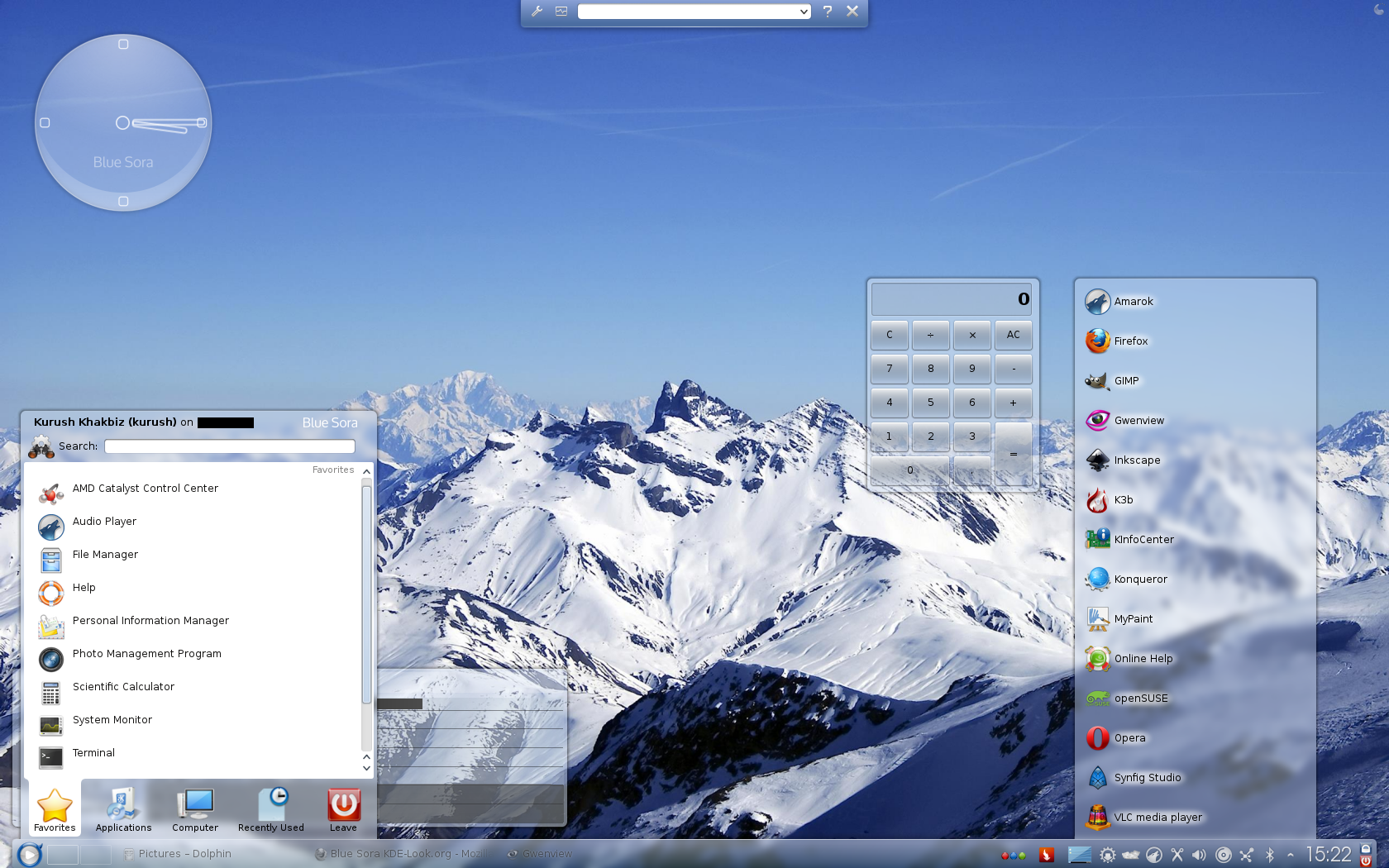

Black Pearl
Deathmachine


Source (link to git-repo or to original if based on someone elses unmodified work):
1.9.2: Redesign borders. Remove systray element. Change gradients to make more smooth. Add two new elements (lineedit.svgz. containment-controls.svgz). Remove kickoff background. Various bug fixed.
1.9.3: Fix panel-background. Change gradient for translucentbackground. Change notification's arrows.
Change tray arrow's color to white to match the icons. Add alternative version with kickoff background on.
2.0:
Add drop shadow for remaining elements.
Fix opaque elements.
Change the color of borders to transparent white.
Analog clock: Remove fill of hands and hour marks. Add new flare for glass layer.
Fix the direction of gradients in panel-background.
Redesign the bubble monitor, fifteenPuzzle and toolbox.
Other tweaks and fixes.
2.0.1:
Adding a new blue layer under the other layers to fix visibility (also it's more blue now).
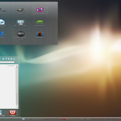
Adding couple of new monochrome icons for system tray (see screenshot #2).
New pager.
Fixing texts shadow (e.g. digital clock).
New vertical/horizontal bar (ported from Oxygen Air theme).
Removing fill from toolbox elements.
Adding more elements (icontasks, toolbar-icons etc,.).
Fix buttons.
Other tweaks and fixes.
Changing icon for Ktorrent to something more suitable.
2.0.3:
Adding new element "listitem" to fix the visibility of notification messages.
Decreasing the size of system tray icons.
Changing the color of notification circle.
Other tweaks and fixes.
Fixing printer icon.
Adding a thermometer as bubble monitor (http://openclipart.org/detail/85069/pixzain-thermometer-by-pixzain).
Various bug fixed.
2.0.5 Manami
Increasing the opacity of drop shadows.
Changing color of translucentbackground and analog clock from gradient to solid color. Also it's much more bright now.
Changing color of gradient for remaining elements.
Adding drop shadow for system tray icons.
Removing blue layers.
Adding new overlay for analog clock.
Decreasing the size of archive by removing unwanted gradients (Vacuum Defs).
Other tweaks and fixes.
3.0 Clouds:
Changing style of borders.
Changing color tone and brightness.
Changing color of texts to fix visibility.
Redo shadows.
Fix ugly border around elements by adding mask.
Other tweaks and fixes.
3.0.1 Clouds:
Fix action button.
3.0.2 Clouds:
Replace font that used in analog clock, shutdown dialog and branding to Oxygen.
Redone drop shadow of analog clock.
Fix shutdown dialog.


More Plasma Themes from Deathmachine:
Other Plasma Themes:

Ratings & Comments
79 Comments
7 To anyone who wants to use this, it's actually pretty good! But this is a 12-year-old theme, so of course there's tons of bugs because some of the themes components just doesn't work/combine well with stuff from new Plasma versions
Hello. I've been using a Plasma 5 -based Debian system via the package manager for ages. Therefore, I'm new to the concept of installing Themes from the KDE Store. Specifically, my older Debian / Stretch system is based on Plasma 5.8. Before I download anything from here, I'd need to know with what minimum version of Plasma 5, each add-on is compatible. Yet, I cannot find this information anywhere. Does anybody know?
I think it's compatible with your Plasma version, though no one knows about this at all.
10 10 the best
Man! This theme is wonderful! I think, it should be included in default KDE base!
Blue Sora seemed to be the answer to my question of what theme should I use, but I stumbled upon an issue: Blue Sora and the non-fullscreen Homerun launcher do not get along. Is that fixable?
all of your themes are excellent :)
Thanks
a icon for VLC in the systray will be excellent, VLC is a popular applicacion, need a systray icon for plasma
Unfortunately VLC/Plasma workspace does not support the monochrome SVG icon for VLC.
I just installed this theme and it rocks!!! This has got to be one of the best, if not the best I've use. Thanks for this theme Deathmachine. Peace
You're welcome ^_^
I love the sleekness of this theme, specially how Kickoff does look - it should be renamed to Kickass. Now, what i find really annoying the almost totally transparent panel that makes pretty difficul to read apps names sitting in the taskbar as well the icons from the systray. I think a more opaque panel -like the background of the systray's widgets gradients- but yet retaining some transparency would be a _killer_. Tnx anyway for this great theme.
I agree with you. I must find a way to fix this problem (maybe more opaque elements like what you said?) Stay tuned for further updates!
How do you set the clock font in the panel? I mean, how do you get the large size?
You mean "branding" right? branding is placed in "/home/user name/.kde4/share/apps/desktoptheme/Blue_Sora/widgets/branding.svgz"
I am not sure if it is the branding, probably not. I mean what font are you using for the time widget in the panel (bottom-right corner) and how do you make it bigger than the system's ordinary font size?
You can't use the regular texts in plasma theme since you don't know if the other have the same font or not, you must convert them to object. The object you talked about called "branding". the dimension of branding is 80x15 pixel.
Hmm. Seems a bit odd to me though, because you can change the font for the digital clock widget in the widget's settings. I saw the branding.svgz file you mentioned and it showed only the "Blue Sora" logo text. I think there is a miscommunication here because I was asking about the font for the digital clock widget in the bottom-right corner on the panel.
Seems you want to change the font for digital clock, right?
Yes. Not just to change the font, I know how to do that, but to change the font size. Also to know which font you are using in your screenshot.
I now have five different "Blue Sora" themes on my system (well, it seems I like it...) and they all look different and they all look nice. Really, before I update I clone the old theme, you'll never know what comes next. And all versions have their special goodies. And from time to time I craft "my" Blue Sora from all versions (e.g. I don't like the flowers that much but prefer the lines from version 0.3.). I admit I don't see any other change in 1.9.3 (compared to 1.9.2) than the slightly other color shading. But the one from 1.9.2 looks more interesting and fresh so I'll keep that. Could you maybe make the linedit.svgz a little darker? It's a bit hard to read the white text on the light blue. Or is it possible to use a darker font for the lineedit fields? And how about some slightly light blue systemtray icons so that they match the arrow for the hidden entries?
It's funny to hear that someone collected different versions of one theme. By the way it's good for comparing. Anyway can you put a screenshot for lineedit to explain the problem? About tray icons, I'm not sure if any color except for white looks good but I will give it try and if it doesn't look good I'll change the color of the arrow to white.
Here is a screenshot of e.g. the AppMenu widget, the search box uses lineedit: http://img4.fotos-hochladen.net/uploads/lineeditvlj7f9zowk.jpg It was no problem while the text was black but now with white it really is hard to read. If the lineedit background would be a little darker it would be better. BTW: Do you still have the last version that had the background image in kickoff? It looked very sleek but you updated too fast so I couldn't save it.
I mean the version that looked like this - opaque background with a small translucent frame: http://img4.fotos-hochladen.net/uploads/bildschirmfoto3lxcn4osd9z.jpg