


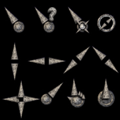
There are some different cursor sizes available: 16x16, 24x24, 32x32 and 64x64, if you want to use an other one than the default of 32x32 Pixels change the "cursors" symlink according to that (See README for further instructions).
Complete Image Source is included.
(SVG Image, Cursor images in 4 sizes and build scripts)
I plan to do an animated version soon.
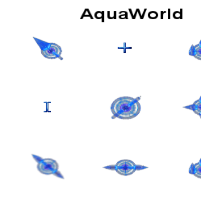
The second link points to a much brighter version. (Fits better to my theme


Ratings & Comments
16 Comments
Cool, I love it! To install in gnome, just move the BlueShinyCursors to ~/.icon!
I LOVE this cursor theme, but I've noticed that the Blue version almost NEVER works properly for me (the cursors are very plain) and the Light version ALWAYS works. I've tried this theme on various distro's, too..but always the same result...
How did you install it? Through the kcontrol module or manually? Because kcontrol has a nasty bug with links in tar files.
I've been using this cursor theme for a while now, I just wanted say thanks :)
I have been looking for a good cursor theme for a long time now. It has finally arrived in the form of your cursors.
Thank you very much.
Well actually I wanted the 32's. I didn't realize that gcursor wasn't changing the size to what I chose, so I had to manually select 32x32. That's the size Ubuntu uses (I think). Thanks for the effort though, I really like these. The only thing I don't like is the link hover, I don't think the arrow with the ball is enough to indicate like the hand does.
What was the problem with gcursor? Was it the fault of this package? I ask because my KDE 3.5 has some problems with links in cursor archives. If you install via kcontrol it unpacks the package but doesn't create the links correctly. The "ball" should apparently visualize a world globe... perhaps i should improve that. Thanks for your comment.
Gcursor works great for installing and choosing the theme, it just doen't seem to be able to choose different sizes in my experiences on Ubuntu and Fedora.
I am using the 64x64 cursor (which actually isn'tn 64x64 but bigger) - very very nice. But I am also not very content with that hand cursor with the ball. I made my own hand cursor for this theme, maybe you want to adapt it. I also changed the no cross to red and adjusted the cursor spot (.conf) for the arrow to 64 1 1 (instead of 64 3 3)and for (my) hand to 70 33 2. With "3 3" I always had the feeling I was not exactly pointing to the right spot. http://img130.imageshack.us/my.php?image=hand5qw.png and http://img96.imageshack.us/my.php?image=no6cw.png
Nah. Color consitency is key in a theme like this.
That's a matter of taste :) For me a "no" and a "link" cursor have to look more eye-catching compared to the rest of the cursors.
I love it, but could you make a 16x16 version please?
No problem... but: can you tell me why you need such small cursors, i think i wouldn't find them on my desktop ;)
He needs it to go with his 2048x1536 screen resolution, 16x16 toolbar icons, 8 pixel menu and desktop fonts and 10 pixel Firefox window fonts. Oh and it's much easier not to "overwhelm" XMMS if you use a microscopic-sized cursor as well. ;-)
;) I got a 3200x1200 Dualhead Setup and miss my cursors all the time therefore the 64x64 Version *g*