Description: ChromeOs-Dark is on GTK-Linux, with four fabulous Material Design flavors. More flavors cycle through all the time, so there is often even more to choose from. ChromeOs-Dark is the highly acclaimed - GTK, xfwm4, GNOME-Shell, and Cinnamon- Dark Mode theme grounded on Material Design standards; and aims to bring a warm, colorful, and elegant experience to your desktop.
The new rankings are still coming in for 2023, and ChromeOs-Dark now enjoys the #3 spot in the GTK Linux world - according to top Linux/GTK site: ubuntupit. In their words: "It has already gained popularity and become one of the most used mate OS themes... It has gone through extreme testing to ensure a vibrant, colorful, and elegant experience... the theme is decorated with grid-based layouts, responsive animations, transitions, depth effects, lighting, and shadow.... just like other Google Apps like Docs, drive, sheets, this theme is also inspired by Google’s Material design." Thanks again faithful users! https://www.ubuntupit.com/best-mate-themes-for-linux/
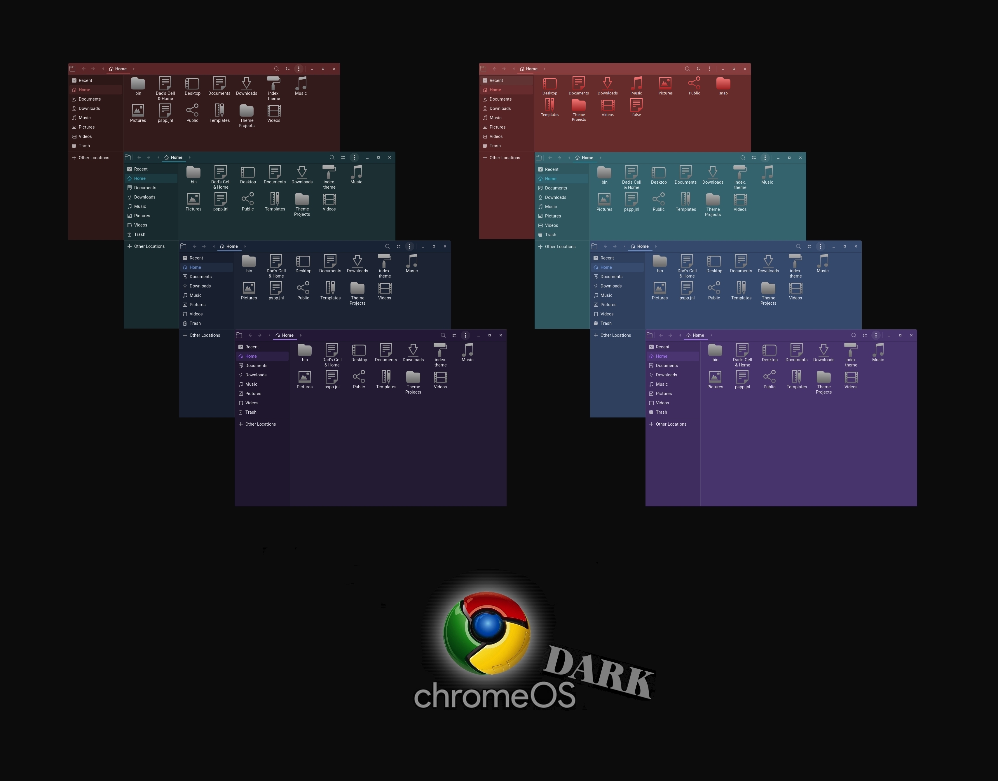
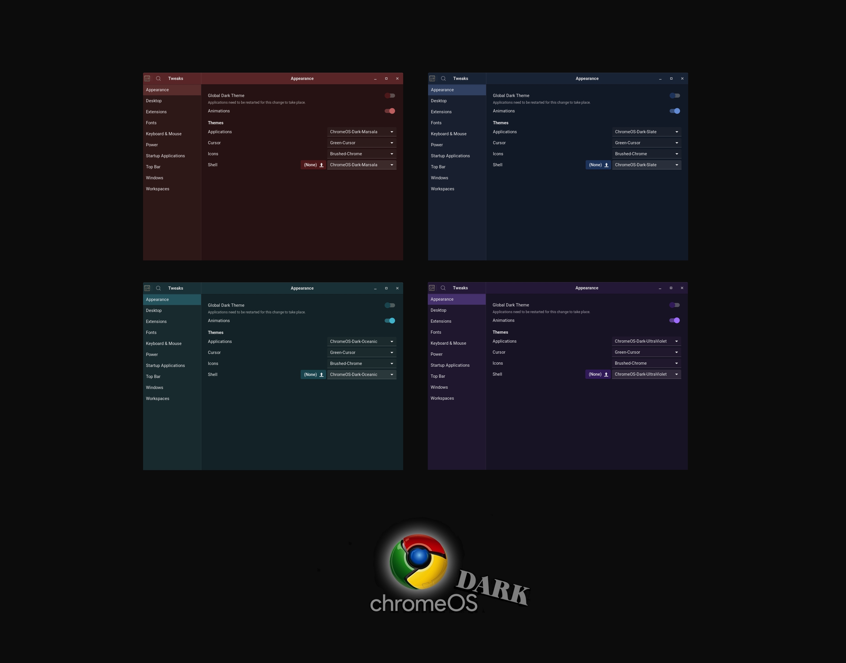
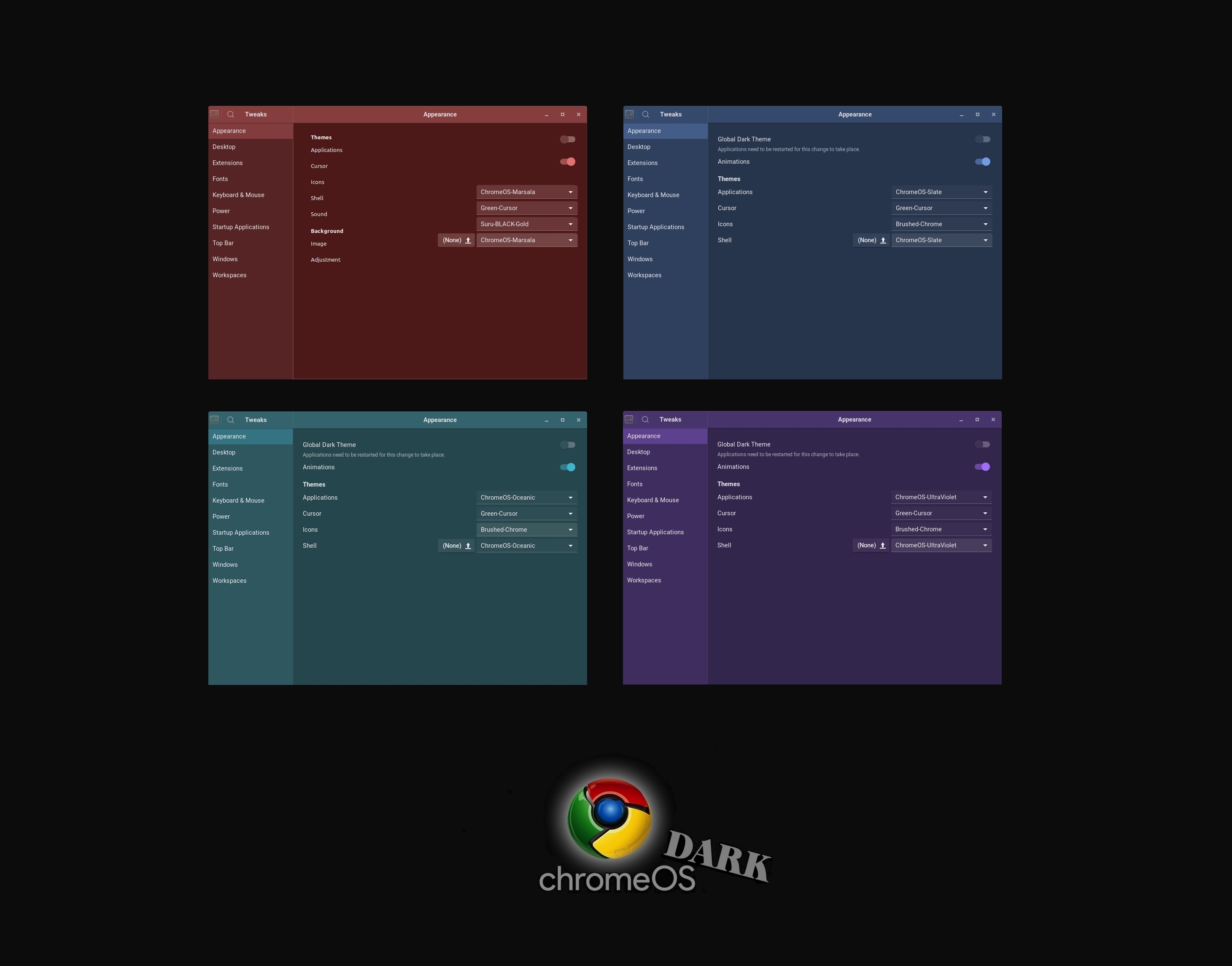
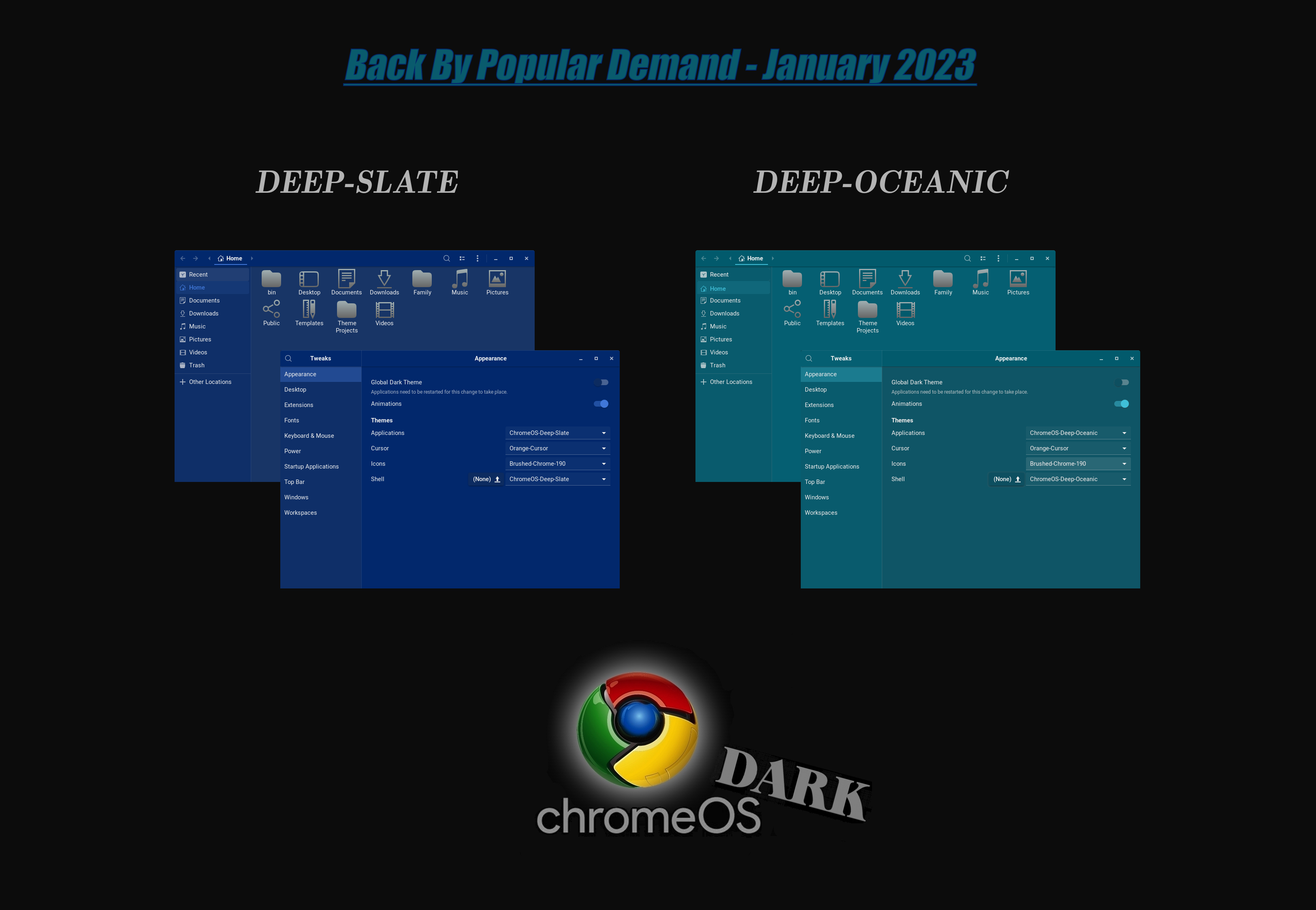
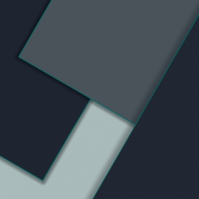
Choose from the four official-based hues of: ChromeOS-Dark-Marsala, ChromeOS-Dark-Oceanic, ChromeOS-Dark-Slate, and ChromeOS-Dark-UltraViolet. All four flavors are also available in 'Darker' modes.
Over the past few years, Google has been moving towards a unified user experience with its Material Design interface. It started with Android, and we’ve seen many Google Apps—like Drive, Docs, and Sheets—get this clean, modern makeover. Material Design makes better use of grid-based layouts, responsive animations and transitions, padding and depth effects, such as, lighting and shadows.
Manual Installation Is Easy:
1) Extract the "tar.xz" file into your "~/.themes/" folder - to install for current user only - or into the "/usr/share/themes/" folder - for the theme to be applied globally. 2) Use GNOME Tweaks, Dconf Editor, or an equivalent 'Look & Feel'/configuration app to enable it for your desktop.
If installing manually, make sure to install the dependency: "Murrine theme engine" if you do not already have it; and update your GTK+packages if you have not.
Logging out and then logging back in may be necessary on some operating systems to fully implement themes and icons.Last changelog:
23-07-06: Version 2.4.3
This update colors the shells' landing page, search-entry:focus-icon for the four "DEEP" variants. Here, the magnifying glass icon now renders the individual theme flavor's accent color when hovered over or when the searchbox is active. Previously, this icon element rendered just a white hue. Comment: b7ed3aa
I love all your work, but in the name of all that is holy, help us out by grouping and limiting the download options. :) Zip or tar. Pick one. We don't care. How about a single download per color, or group them by border type. Because we have to wait 10 seconds for each download, it takes f o r e v e r...... Thanks for all your work!
Hah, you're just sore at me for the delayed release of the COYLE-Desktop theme - it's coming along. My life has never been more hectic!! Nothing but love your way, bro!
Absolute Delighted !!!. Just what I'm looking for. Usually Dark Themes are to dark with fonts to bright that cause fatigue. There are wonderfull light themes also but with large bright white areas that do the same. Your approach is very good regarding eye confort specially the Dark ones. I have to says that I download all the available variants and I keep actually with Dark Oceanic ;-) Thank You So Much for your Work. All the Best !
That's really great to hear xartur. It's not by accident; the team has been tasked with with providing themes for both low vision clients and also those with highly light-sensitive or easily fatigued eyes. For you, our rtl88 team's brand new "ink" desktop theme may also suit you well. It is perhaps the only other of ours, still in development, that captures that near magic combination of features you talk about here. It can take months of testing to achieve it on a new design, and it still rarely meets our standard to be released.
Hi Triceratops, the screenshots show what is available for download: "Dark," 'Darker," and "Deep." They're all part of "ChromeOs-Dark." Tthe standard "dark," variant - shown on the screenshots and available for download - are lighter than the "Darker" variant (as shown). I hope that clears it up. Take care!
I'm glad you are okay with all now. Please keep in mind though that the theme's name is called "ChromeOs-Dark," so the standard variants are called ChromeOS-Dark-(some color). For instance, the download file for the standard, [least-dark] variant, shown in first screenshot, on the right side, indeed has it's identical download file here, and it's named ChromeOS-Dark-(some color). Thanks for dealing with the naming, Triceratops, they've been those names for some years now.
Please ignore. Not sure where is the standard version but I can manage Ok with the dark one. I use https://github.com/odziom91/libadwaita-theme-changer to override the libadwaita effects. Applying this utility then logout/login, your ChromeOS dark themes looks fantastic. Thanks very much
10This theme is the absolute best. Bumping rating to max. The glitch on the top bar of Gnome Tweak is annoying but minor as, for some reasons, only Gnome Tweak is affected. Other apps looks perfect.
This theme is absolutely amazing!!!!
I finally found a dark-like theme for my XFCE 4.14 with two flavors for day and night ambient light.
Really thank you for making it!!!


Ratings & Comments
54 Comments
I love all your work, but in the name of all that is holy, help us out by grouping and limiting the download options. :) Zip or tar. Pick one. We don't care. How about a single download per color, or group them by border type. Because we have to wait 10 seconds for each download, it takes f o r e v e r...... Thanks for all your work!
Hah, you're just sore at me for the delayed release of the COYLE-Desktop theme - it's coming along. My life has never been more hectic!! Nothing but love your way, bro!
Hahaha. Some day I gotta buy you a nice cold beer.
10 Oooopppps I forgot to Rank !
Absolute Delighted !!!. Just what I'm looking for. Usually Dark Themes are to dark with fonts to bright that cause fatigue. There are wonderfull light themes also but with large bright white areas that do the same. Your approach is very good regarding eye confort specially the Dark ones. I have to says that I download all the available variants and I keep actually with Dark Oceanic ;-) Thank You So Much for your Work. All the Best !
That's really great to hear xartur. It's not by accident; the team has been tasked with with providing themes for both low vision clients and also those with highly light-sensitive or easily fatigued eyes. For you, our rtl88 team's brand new "ink" desktop theme may also suit you well. It is perhaps the only other of ours, still in development, that captures that near magic combination of features you talk about here. It can take months of testing to achieve it on a new design, and it still rarely meets our standard to be released.
Screenshot show Slate and Oceanic (non dark) but there is no corresponding download
Hi Triceratops, the screenshots show what is available for download: "Dark," 'Darker," and "Deep." They're all part of "ChromeOs-Dark." Tthe standard "dark," variant - shown on the screenshots and available for download - are lighter than the "Darker" variant (as shown). I hope that clears it up. Take care!
Sorry not clear. Where is the download of the standard, nondark ChomeOS? Shown in first screenshot, on the right side.
I'm glad you are okay with all now. Please keep in mind though that the theme's name is called "ChromeOs-Dark," so the standard variants are called ChromeOS-Dark-(some color). For instance, the download file for the standard, [least-dark] variant, shown in first screenshot, on the right side, indeed has it's identical download file here, and it's named ChromeOS-Dark-(some color). Thanks for dealing with the naming, Triceratops, they've been those names for some years now.
Please ignore. Not sure where is the standard version but I can manage Ok with the dark one. I use https://github.com/odziom91/libadwaita-theme-changer to override the libadwaita effects. Applying this utility then logout/login, your ChromeOS dark themes looks fantastic. Thanks very much
10 Yes, not the the others!!
10 These truly are unique among so many here. I'm glad you're back dude!
10 Looks great ! Thanks
10 thanks fosr add
10 This theme is the absolute best. Bumping rating to max. The glitch on the top bar of Gnome Tweak is annoying but minor as, for some reasons, only Gnome Tweak is affected. Other apps looks perfect.
10 None better, thanks!
Looks outstanding, like a Chrome itself
That's a good endorsement of the team's exacting standards for accomplishing precisely what you say. Thank you!
9 9 excellent
10 10 the best
10 10 the best
10 10 the best
This theme is absolutely amazing!!!! I finally found a dark-like theme for my XFCE 4.14 with two flavors for day and night ambient light. Really thank you for making it!!!
Thank you, from the team! A lot folks are involved in this one - hence, all the cool variants.